
HAIR COLOR GUIDE · SMARTGENIUSAI
How to Try a New Hair Color Before Dyeing Your Hair
Changing hair color can be a bigger commitment than it looks on a swatch. The same blonde, copper, brunette or vivid shade can feel completely different next to your skin, eyes, brows, clothing and lighting. A virtual hair-color preview lets you compare directions on your own photo before you bleach, dye or book a salon appointment.
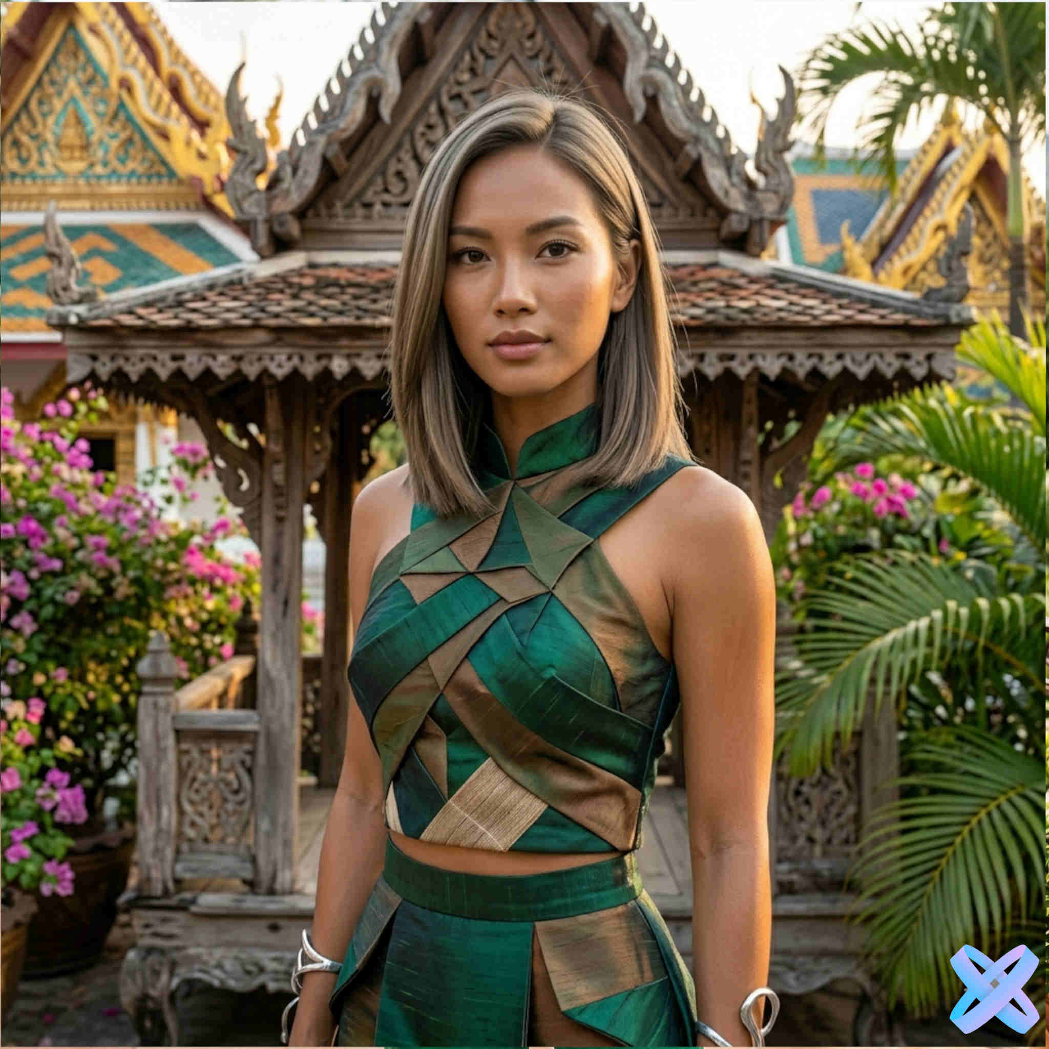
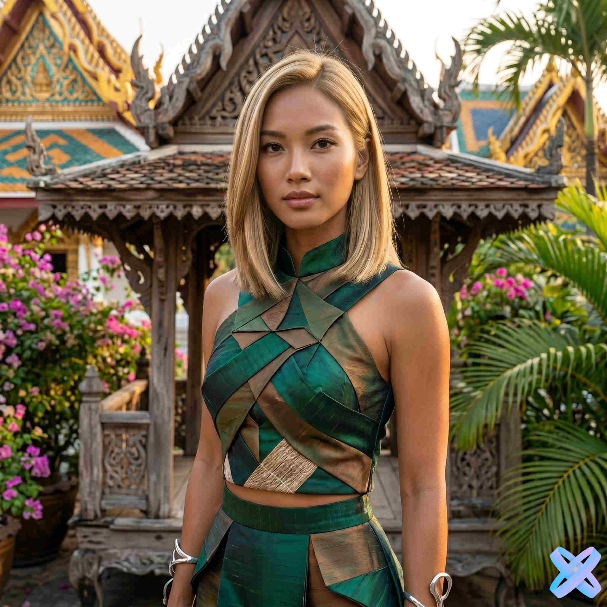
When choosing a new hair color, keep the haircut, length and texture the same and change only the shade. Compare a small set of color families first — lighter, darker, warmer, cooler — then refine the exact tone. This makes it much easier to understand whether you like the color itself.
Why a hair-color swatch is not enough
A salon swatch or product box shows the color in isolation. Your hair never exists in isolation. It sits next to your face, brows, eyes, clothing and background, and it reflects the light around you. A warm copper can look vibrant in daylight and much deeper indoors. A very cool ash shade can feel sophisticated in one portrait and washed out in another because of the lighting.
That is why hair-color selection is partly relational. You are not only choosing “blonde” or “brown”; you are choosing how a new color changes the contrast and temperature of your whole portrait.
A virtual try-on is useful because it brings the shade into that context. It does not predict the exact chemistry of dye on your real hair, but it can quickly eliminate directions you dislike and identify color families worth discussing with a professional.
Separate hair color from haircut before you compare
If you change from long dark hair to a short platinum bob in one step, you may love the result without knowing whether you love the cut, the color or the combination. For a useful color decision, freeze the hairstyle first.
The dedicated SmartGeniusAI Hair Color workflow is designed around that idea: it changes visible hair shade while aiming to keep the haircut, length, volume, texture, part and overall silhouette stable. That makes the comparison much cleaner than a full makeover where everything changes at once.
Start with color families, not dozens of nearly identical shades
Before comparing subtle tones, test broad directions. A simple first pass might include:
Blonde or lighter brown
Shows how lower hair-to-face contrast changes the portrait.
Copper, auburn or warm brown
Adds visible red or golden character and can change the temperature of the entire look.
Deep brunette or black
Creates stronger contrast and a more defined hair silhouette in many portraits.
If you want creative color, add one vivid family such as pink, blue or green as a separate experiment. Once you know which family feels right, compare variations inside it.
Warm, neutral and cool hair colors: what changes visually?
Color temperature is one of the fastest ways to organize choices.
Warm shades
Golden blonde, honey, caramel, copper, ginger and warm chestnut contain more yellow, orange or red character. They can make the whole portrait feel warmer and more luminous, especially in neutral daylight.
Neutral shades
Neutral brown and balanced blonde sit between obvious warmth and coolness. They are useful as a baseline when you want a natural-looking comparison without pushing the portrait strongly toward gold or ash.
Cool shades
Ash blonde, cool brown, platinum and silver reduce visible warmth. They can create a cleaner or more graphic contrast, but they also react strongly to warm indoor lighting, which may make the preview look different from a salon photo taken under cooler light.
Do not assume that skin “undertone rules” should make the decision for you. Warm-on-warm can look harmonious, while warm hair against cooler-looking skin can create intentional contrast. Previewing both is more useful than rejecting a direction from a chart.
How lighting changes the way hair color looks
Hair is reflective and three-dimensional. Highlights can be much lighter than the base color, while shadows can be several shades deeper. That means a digital color value should never be interpreted as one flat RGB block applied to every strand.
Warm indoor lighting
Can make blonde, brown and red hair appear more golden or copper than they would in neutral daylight.
Cool daylight
Can make ash and neutral shades appear cleaner and can reduce visible warmth.
Strong direct sunlight
Creates bright highlights that may make the hair look substantially lighter than its base shade.
Dark or mixed lighting
Can hide subtle tone differences. If your source photo has colored LEDs or strong orange room light, treat the result carefully.
For comparing shades, use the same source portrait every time. If you change the photo, you also change the lighting environment and make the comparison less reliable.
Starting hair color matters in the real world
A virtual preview can show what a target shade looks like visually, but real dye chemistry depends on where you start. Moving from very dark hair to pale blonde can require significant lifting. Previously dyed hair may behave differently from virgin hair. Red pigment can be persistent. Porous or damaged sections can take color unevenly.
This is one of the most important boundaries of an AI preview: it can help you choose the destination, but it cannot tell you the safest or easiest chemical route to get there.
If the change is large — especially dark to blonde, black box dye to lighter color, or repeated bleaching — use the preview as a reference and ask a qualified colorist what is realistic for your hair condition.
How to compare blonde shades before bleaching
“Blonde” covers a huge range. Start with brightness and temperature rather than exact salon names.
- Dark blonde / bronde: a smaller jump from brunette and often a useful low-contrast test.
- Golden or honey blonde: visibly warmer, with more yellow or gold character.
- Beige blonde: a more balanced direction between warm and cool.
- Ash blonde: reduced warmth and a cooler impression.
- Platinum: very light and high-impact; compare carefully because the change in contrast can be dramatic.
If platinum feels too strong, that does not mean blonde is wrong. Move down in brightness before abandoning the whole family.
How to compare brunette and black shades
Darker hair can make the silhouette read more clearly, especially against a lighter background. But “dark” also includes different temperatures.
Compare a softer medium brown, a deep chocolate or espresso direction, and black if you are considering a major darkening. Look at brow contrast and how strongly the hair frames the face.
Very dark hair can be visually powerful, but permanent black dye can also be difficult to lift later. The practical commitment is one more reason to preview the direction before coloring.
Red, copper and auburn: compare saturation as well as warmth
Red hair colors vary from natural-looking copper and auburn to highly saturated cherry or vivid red. Two red shades can differ more in intensity than in basic hue.
Test a muted warm copper first, then a deeper auburn, then a more vivid red if that is the direction you want. Look at how the color competes with or complements your natural facial contrast.
Because red tones can photograph differently under warm lighting, save the preview as inspiration rather than an exact dye formula.
Creative colors: pink, blue, green and beyond
Vivid color is where virtual try-on becomes especially useful because the real change may require bleaching, multiple salon steps or frequent maintenance. Test the visual effect before committing to the process.
For creative color, compare:
- pastel vs saturated intensity;
- warm pink vs cool magenta;
- navy vs bright blue;
- teal vs pure green;
- full-head color vs the idea of a more limited accent, if you plan to discuss options with a colorist.
The current SmartGeniusAI color page supports ready shades and a custom RGB choice as a visual reference. Remember that a digital RGB value is not a salon formula and will still be adapted to the visible texture, highlights and shadows of the source photo.
Should hair color match your eyebrows?
It does not have to match exactly. Natural hair and brows often differ in depth, and dyed hair can intentionally create more contrast. But the relationship matters visually.
When you preview a much lighter or darker shade, look at the brows as part of the full face rather than focusing only on the hair. If the contrast feels too strong, you might prefer a less extreme hair shade. Do not assume you must also recolor brows; that is a separate beauty decision with its own safety considerations.
Hair color and eye color: use contrast, not rigid matching rules
Lists such as “best hair colors for green eyes” can be useful for inspiration, but they often overstate the idea that a specific shade is universally optimal. Hair color affects how strongly eye color stands out because it changes the overall contrast around the face.
A darker shade may make lighter eyes appear more noticeable. A warm copper may echo warm flecks in some irises. A cool platinum may create a high-contrast editorial look. The easiest way to judge that interaction is on your own portrait.
Use two different source photos before a major color change
For hairstyle shape, keeping one photo fixed is ideal. For a high-commitment color change, there is an additional useful step: after choosing a favorite shade on one portrait, test it on a second photo taken in different but normal lighting.
If you like the direction in both neutral daylight and ordinary indoor light, you have a stronger signal that you like the color family rather than one flattering photograph.
This does not require dozens of images. Two representative conditions are enough to expose many lighting-dependent surprises.
What a virtual hair-color preview cannot promise
- the exact salon dye formula;
- how many bleaching or coloring sessions you will need;
- the health of hair after a chemical process;
- perfect color matching between screens and real life;
- how quickly a vivid shade will fade;
- how the color will look under every light source.
Those are real-world material questions. The preview is strongest at answering the visual question: “Do I like this family of color on my own portrait enough to investigate it further?”
How to try hair color with SmartGeniusAI
Use the dedicated SmartGeniusAI Hair Color page when the goal is to compare color without changing the haircut. The workflow is intentionally separated from the broader hairstyle changer so length, volume, texture and part remain the reference point.
Choose a clear portrait
Hair should be visible with enough detail to preserve natural highlights and shadows.
Test broad color directions
Compare lighter, darker, warmer and cooler families before tiny shade differences.
Shortlist two or three shades
Compare them on the same source, then optionally test the favorite on a second normally lit portrait.
Preview a new hair color before dyeing
Keep your haircut and length intact while comparing blonde, brunette, red and creative color directions on your own photo.
Frequently asked questions
Can I see what I would look like blonde before bleaching?
Yes. A virtual preview can show the visual effect of lighter blonde directions on your portrait. It cannot predict how many real bleaching sessions your starting hair would require.
Can I try red or copper hair on a photo?
Yes. Compare muted copper, deeper auburn and more vivid red separately. Using the same source image makes saturation and temperature differences easier to judge.
Does virtual hair color keep my haircut the same?
The dedicated SmartGeniusAI color workflow is designed to preserve haircut, length, volume, texture, part and silhouette while changing visible hair color.
Can I choose a custom color?
The tool includes ready shades and a custom RGB option. Treat a custom RGB value as a visual reference, not an exact dye formula or guaranteed monitor-to-hair match.
Why does the same color look different in two photos?
Lighting, exposure, original hair depth and surrounding colors affect how a shade is perceived. Compare shades on the same source photo first.
Can AI tell me which dye is safe for my hair?
No. It visualizes the target look. For bleaching, corrective color or major chemical changes, a qualified colorist should assess your real hair condition and history.
Final takeaway
A good virtual hair-color test reduces the decision to one variable at a time. Keep your hairstyle fixed, compare broad color families, then refine brightness and temperature. Use consistent lighting for the first comparison and remember that the preview shows a visual destination, not the chemistry required to reach it. If you can walk into a salon knowing “I like a medium warm copper on my own face, but platinum feels too high-contrast,” the preview has already done its job.