
LIPSTICK COLOR GUIDE · SMARTGENIUSAI
What Lipstick Color Suits Me? How to Choose the Right Shade
Lipstick can change the whole balance of a portrait with one small area of color. The same red can look classic, overpowering, warm or cool depending on the wearer and the rest of the makeup. Instead of trying to memorize a list of “correct” shades, compare color families on your own face and watch how they change contrast, teeth, skin and the focal point of the image.
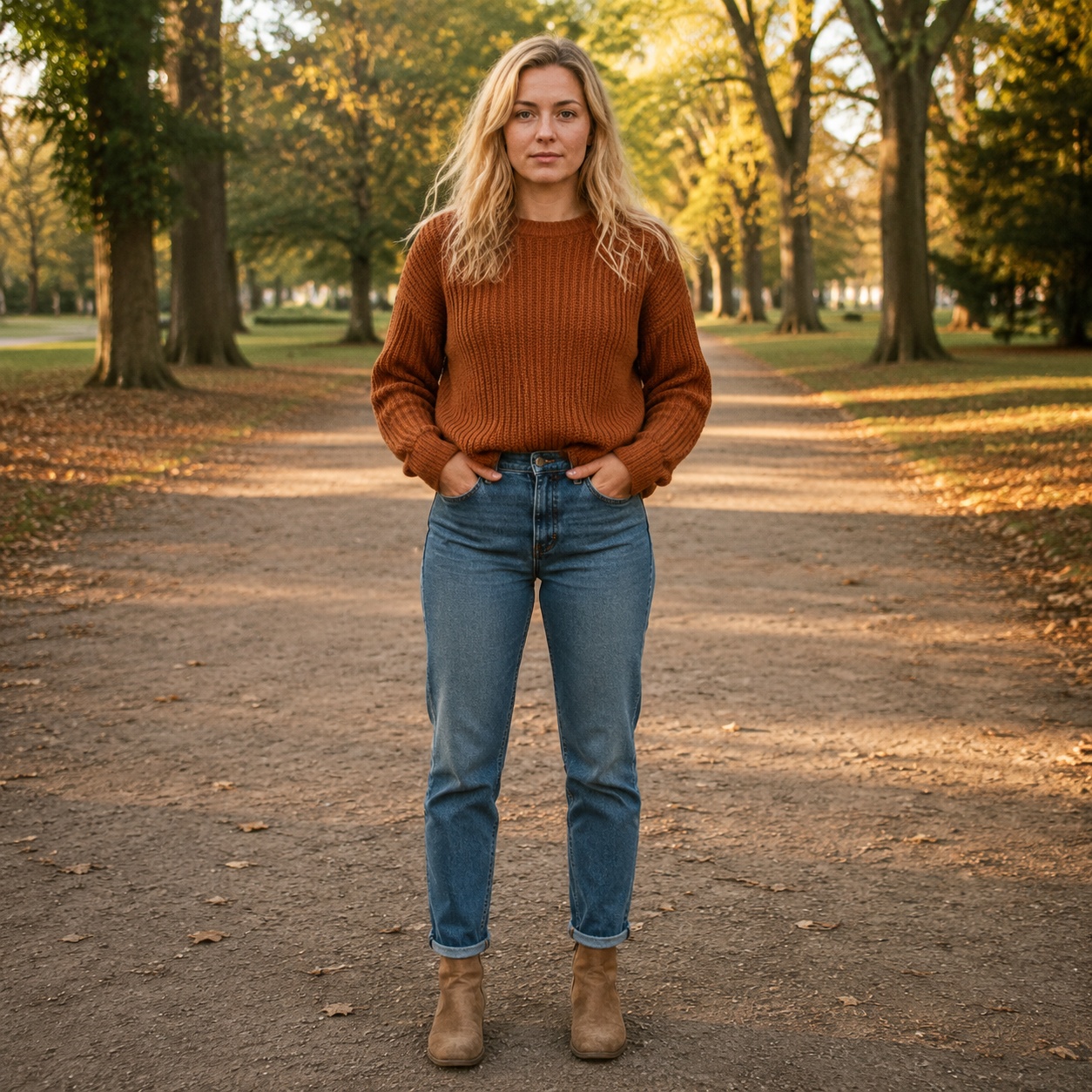
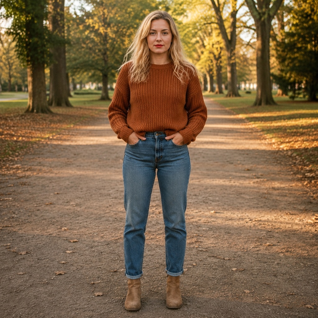
Compare Nude, Red and Berry first. They create three clearly different levels of color and depth. Once you know whether you prefer low, medium or strong lip contrast, Pink, Burgundy and Brown become easier to evaluate.
Start with contrast, then refine undertone
Lipstick advice often begins with undertones, but contrast is easier to see and often more important. A nude shade can keep the portrait quiet; red creates a clear focal point; burgundy or deep berry adds both saturation and depth. Decide how much attention you want the lips to carry before worrying about the exact temperature.
Once the intensity feels right, compare warmer and cooler versions within that family in real life. Camera white balance can shift color enough that an AI image should not be treated as a laboratory-accurate shade match.
How the six SmartGeniusAI lipstick color families differ
| Color | Typical effect | Watch for |
|---|---|---|
| Nude | Low contrast, polished and quiet | Too close to skin tone can erase the mouth |
| Pink | Fresh color with moderate contrast | Very cool pink may feel disconnected from a warm palette |
| Red | Classic strong focal point | Balance with eye intensity |
| Berry | Rich color with softer complexity than bright red | Depth can increase quickly on low-contrast faces |
| Burgundy | Deep dramatic mouth | Can dominate small portraits |
| Brown | Earthy, neutral-to-warm definition | Needs enough separation from skin and surrounding makeup |
Nude lipstick: the goal is harmony, not invisibility
A successful nude lip still has enough edge and color to define the mouth. If the shade nearly matches the surrounding skin, the lips can appear flattened in photographs. Compare a natural nude with your bare lip and check whether the mouth remains readable at thumbnail size.
If nude feels washed out, you may not need a brighter color. A slightly deeper nude, a satin finish or more lip-liner definition can restore structure without changing the overall low-contrast direction.
Pink lipstick: useful when you want freshness without a classic red signal
Pink can range from muted rose to cooler candy tones, so the category is broad. In a virtual test, focus on whether the color adds life to the face while remaining connected to blush and eye makeup. A soft natural pink is often easier to integrate than a very blue-based bright pink.
Pink is also a useful bridge between nude and red when you want more presence but not a formal or dramatic focal point.
Red lipstick: decide whether you want the mouth to lead
Red creates a strong color anchor. It can make the complexion appear clearer and the teeth appear brighter or darker depending on the exact hue. More importantly, it changes the hierarchy of the face. If the eye makeup is already strong, a red lip may create a deliberately high-contrast look.
Compare red with a clean eye and with your usual eye makeup. The better pairing tells you whether the issue is the red itself or competition elsewhere.
Berry and Burgundy: depth matters as much as hue
Berry adds richness without always feeling as graphic as true red. Burgundy goes deeper and can create a sophisticated evening or editorial effect. Both become visually heavier as value darkens, which means the same color family can feel very different depending on depth.
When previewing, watch the lower half of the face at normal size. If the mouth becomes disproportionately dominant, try a slightly lighter berry or switch the finish from matte to satin.
Brown lipstick: a neutral can still be a statement
Brown lipstick can feel understated when it sits near the wearer’s natural coloring, or deliberately 1990s-inspired when it is deeper and more defined. Warm brown can connect beautifully with bronzed or gold eye makeup, while cooler taupe-browns create a different mood.
Use the preview to judge separation from skin. The lips need enough tonal difference to retain shape.
Compare lipstick colors on your own photo
Use SmartGeniusAI Lipstick to try Nude, Pink, Red, Berry, Burgundy and Brown while keeping the rest of your face consistent.
Matte, satin or gloss can change whether the same color works
Finish changes both texture and reflected light. Matte makes edges and pigment feel more graphic. Satin softens the surface and often looks more forgiving. Gloss adds highlights that can make lips look fuller and fresher, but it can also become the brightest element in direct light.
If you like a color but not the preview, test another finish before rejecting the shade family. The problem may be texture, not hue.
Use the rest of the makeup as context
A lip color never exists alone. Smokey Eyes plus Burgundy creates a very different total contrast from Soft Shadow plus Burgundy. Gold Glam and warm Brown can feel intentionally coordinated, while Cat Eye plus Red creates a classic graphic combination.
When you are choosing lipstick for an existing makeup look, keep the eye and skin styling constant while changing only the lip. That is the cleanest comparison.
A practical lipstick testing sequence
Start with your natural lip
Use it as the baseline for intensity and value.
Test Nude, Red and Berry
These reveal low, clear and deep contrast quickly.
Refine the winning family
Compare Pink, Burgundy or Brown based on what you learned.
Change finish last
Only after the color family works should you decide matte, satin or gloss.
Your natural lip color changes the starting point
Two people can apply the same lipstick and get different visible results because the base lip pigmentation is different. A sheer nude may look beige on one person and rosy on another. AI previews simplify that physical layering, so use them to choose direction rather than predict exact opacity.
When recreating the look, compare the product on your own lips instead of relying only on a swatch shown on skin or a model.
Teeth and surrounding skin influence perceived lipstick color
A lipstick is surrounded by warm skin tones and the brightness of the teeth, so its apparent hue is contextual. Blue-leaning reds can sometimes create the impression of brighter teeth, while very warm shades may interact differently. Camera white balance can change this effect further.
Treat the preview as a broad visual check, not a precise promise about tooth color or undertone chemistry.
Lip liner can change the same shade more than expected
A deeper liner increases edge contrast and can make a lipstick feel more structured. A liner close to the lipstick color creates a cleaner, more uniform result. A softer blurred edge makes even a saturated color feel less graphic.
If you love a color but dislike how severe it looks, consider changing the boundary treatment before changing the shade family.
Small lips and full lips do not require opposite color rules
Dark colors can visually reduce reflected light and create a more compact impression, while gloss can add highlights that emphasize volume, but these are effects—not prohibitions. A person with smaller lips can still wear burgundy, and a person with full lips can still wear gloss if that is the desired style.
Preview the entire face. The lip should be judged as part of the portrait rather than against a size-based rule.
Use clothing near the face as a second color test
A red top, pink scarf or cool blue jacket can shift how lipstick feels because the eye compares nearby colors. Once you find two or three candidate lip families, test them with the outfit you actually plan to wear.
This is especially useful for event photography, where clothing occupies much more of the final frame than a beauty close-up suggests.
Create a personal lipstick map instead of one “best shade”
It is more useful to identify one low-contrast color, one everyday color and one statement color than to search for a single universal winner. For example, Nude may serve quiet looks, Pink or Brown may become the daily option, and Red or Berry may handle events.
Once those roles are clear, future shopping becomes easier because you can judge a new product against an existing slot in your palette rather than asking whether it is objectively flattering.
Frequently asked questions
How do I know which lipstick color suits me?
Compare how each color changes facial contrast and focal point. Start broad with Nude, Red and Berry, then refine undertone and finish.
Should lipstick match my undertone exactly?
Undertone is useful, but it is not a strict rule. Clothing, eye makeup, hair color and desired contrast can make a supposedly “opposite” shade work well.
Why does nude lipstick make me look washed out?
It may be too close to your skin value or too low in saturation. Try a deeper nude or a satin finish that preserves more definition.
Which lipstick finish looks most natural?
Satin often sits between matte and gloss, but the most natural option depends on your real lip texture and the rest of the makeup.
Can AI choose the exact product shade for me?
Use AI for visual direction, not exact product matching. Lighting and display color can shift the appearance of a specific shade.
Final takeaway
Choose lipstick in two stages: first decide how much visual weight you want the mouth to carry, then refine the color temperature and finish. A controlled try-on on one portrait makes those decisions much clearer than comparing swatches on different models.